The mechanical degradation of digital advertising funnels rarely occurs at the impression level; it almost exclusively begins at the post-click destination. While organizations invest heavily in programmatic advertising, search engine marketing, and sophisticated targeting algorithms, the fundamental architecture of the destination page dictates whether that financial investment yields a positive return or evaporates into bounce rates. Understanding what makes a good landing page requires a departure from subjective aesthetic preferences and a rigorous pivot toward empirical conversion rate optimization (CRO), user psychology, and backend performance metrics. A highly optimized page does not merely present information; it engineers a controlled environment where the user’s cognitive load is minimized, and the path to conversion becomes the only logical progression.
For enterprises and specialized consultancies, such as an SEO Agency Milton Keynes, the underlying architecture of a landing page is not merely a design consideration; it is the operational threshold that dictates overall customer acquisition costs (CAC). When traffic acquisition costs rise, the efficiency of the landing page becomes the primary lever for maintaining profitability. The cost of an unoptimized user flow is severe: across all industries, the median landing page conversion rate sits at approximately 4.02%, while general website pages convert at a mere 2.35%. Closing this gap and pushing a digital asset into the top quartile of performance where conversion rates frequently exceed 11.45% requires meticulous alignment of server speed, user intent, and structured data.
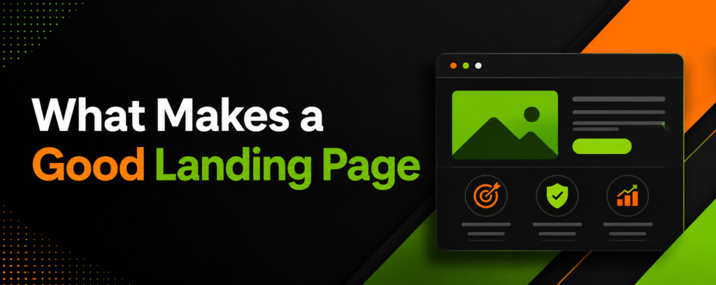
The Purpose of a Landing Page
The structural purpose of a landing page is to capture and convert specific user intent without the conversational distractions inherent to a standard website environment. Unlike corporate homepages, which serve as directories encouraging broad exploration, landing pages act as hyper-focused conversion funnels. The problem most organizations face is “traffic leakage,” a phenomenon where paid or highly targeted organic traffic is deposited onto a generic page containing multiple exit vectors. The financial cost of this unstructured routing is profound: users abandon the session when they are forced to actively search for the solution promised in the referring advertisement or search query.
By isolating the user experience to a singular objective, landing pages systematically mitigate decision fatigue. A dedicated landing page aligns the “conversion scent” the psychological and visual consistency between the ad’s promise and the page’s delivery ensuring that the narrative remains unbroken from click to capture. This structural isolation yields massive efficiency gains; data indicates that dedicated landing pages convert at a median of 6.6% across all industries, significantly outperforming mixed-purpose digital real estate. Furthermore, increasing the volume of targeted landing pages from 10 to 15 has been shown to increase total lead volume by 55%, proving that highly segmented, purpose-built pages capture intent far more efficiently than generalized routing.
Common Uses of a Landing Page
Landing pages are deployed across various stages of the customer lifecycle, acting as the primary collection mechanisms for zero-party and first-party data. The deployment strategy inherently dictates the architectural requirements, form length, and visual hierarchy of the page. Understanding these applications is critical for setting baseline performance expectations, as cross-industry comparisons are often fundamentally flawed.
Lead generation for B2B and professional services typically involves exchanging high-value assets such as comprehensive whitepapers, exclusive webinars, or proprietary industry reports for user contact information. The efficiency of these pages is strictly measured by the visitor-to-lead conversion rate. Intent modifiers play a massive role here. For instance, legal services often capture highly localized, urgent intent, yielding extraordinary conversion rates around 7.4%. Conversely, the B2B SaaS sector typically experiences highly considered buying cycles involving multiple stakeholders, resulting in a 1.1% to 2.1% median conversion rate for direct inquiries.
SaaS free trial and demo request pages are engineered to transition users from passive awareness to active product evaluation. These pages rely heavily on frictionless sign-up flows, social proof, and dynamic product previews, often achieving conversion rates between 7.0% and 10.0% when optimized correctly. Finally, e-commerce product and squeeze pages isolate the buyer from the broader catalog to force a binary purchase decision. These pages typically convert between 2.0% and 5.0%, relying on live inventory signals, 360-degree product views, and urgency triggers.
| Industry / Application | Median Conversion Rate | Intent Profile & Structural Requirements |
| Legal Services | 7.40% |
High urgency, localized intent requiring immediate trust signals. |
| SaaS Free-Trial | 7.00% – 10.00% |
High evaluation, low initial friction requiring multi-step onboarding. |
| Financial Services | 5.01% |
High consideration, heavily reliant on security badges and E-A-T. |
| E-commerce / Retail | 2.00% – 4.00% |
Transactional, requiring fast load times and visual-heavy decision making. |
| B2B SaaS (General) | 1.10% |
Complex buying committee, necessitating detailed technical specs and case studies. |
Start with an Irresistible Value Proposition
A value proposition cannot simply state what a company does; it must immediately quantify the economic, technical, or operational benefit to the user. When users land on a page, they execute a rapid, subconscious cost-benefit analysis. If the perceived cognitive effort required to understand the offer exceeds the perceived value of the solution, abandonment is instantaneous.
The 3-Second Rule to Stop the Scroll
The “3-Second Rule” dictates that a user must understand the core offering, the primary benefit, and the required action within three seconds of the page rendering. This is not merely an attention span metric; it is a biological and technical reality. Technically, a user begins judging the page before the DOM is fully interactive. Over 53% of mobile users abandon a site if it takes longer than three seconds to render, treating technical lag as a direct indicator of low corporate competence. Cognitively, the headline must serve as an immediate anchor. The visual hierarchy must prioritize the primary value proposition, placing it securely above the fold.
Eye-tracking studies of the F-pattern demonstrate that users scan the first two words of a headline to decide if the remainder of the text warrants their attention. Front-loading high-impact, intent-matching keywords prevents the user from scrolling past the critical conversion trigger. If the page is selling predictive maintenance software, the headline cannot simply read “Better Software for Factories.” It must explicitly state the quantifiable benefit: “Reduce Unplanned Downtime by 40% with Predictive Analytics.”
How Subheadlines Keep Readers on the Page
While the headline arrests the scroll, the subheadline assumes the heavy burden of retaining attention and providing the logical, mechanical justification for the initial claim. Textbook marketing frequently recommends extreme brevity at all costs, but empirical data challenges this assumption. Subheadlines consisting of 10 to 20 words actually convert 14% better than ultra-short one-liners and 22% better than lengthy paragraph blocks. The subheadline acts as the transitional connective tissue between the bold promise of the headline and the mechanical reality of the Call to Action. It must clarify the mechanism of the value proposition. If the headline promises a massive reduction in cloud infrastructure costs, the subheadline must briefly explain the proprietary algorithm, the zero-downtime migration process, or the specific audit methodology that makes this financial reduction possible. This satisfies the analytical buyer who requires logical justification before committing to a click.
Ditch the Navigation to Focus Attention
The presence of global website navigation on a landing page introduces a severe liability known in UX design as the paradox of choice. When presented with multiple exit vectors such as “About Us,” “Services,” “Careers,” or “Blog” the user’s cognitive load increases exponentially, and their likelihood of completing the primary conversion action plummets. Removing the navigation menu forces a singular, binary decision: convert or exit. This structural isolation increases the page’s attention ratio to an optimal 1:1, meaning there is exactly one interactive element corresponding to one campaign goal. Analytics confirm the profound efficacy of this approach; removing standard navigation links from a landing page can increase sign-up conversion rates by as much as 100%. For an enterprise spending $50,000 monthly on paid acquisition, doubling the conversion rate through the simple removal of DOM header elements effectively halves the cost per lead, yielding massive efficiency gains without requiring a single dollar of additional ad spend.
The Psychology Behind Clickable Calls to Action
A Call to Action (CTA) is the interactive fulcrum of the entire landing page. Its effectiveness relies heavily on psycholinguistics, visual contrast, spatial positioning, and perceived effort. A poorly optimized CTA can derail a user who is otherwise fully convinced by the value proposition.
Use Action Copy for Value Driven Phrases
The terminology used on a button directly impacts the perceived risk and reward of the impending click. Friction-heavy words like “Submit,” “Register,” or “Buy” emphasize the cost of the interaction what the user must give up in terms of time, personal data, or capital. Testing reveals that utilizing the generic word “Submit” as CTA anchor text can reduce overall conversion rates by as much as 3%. Instead, action copy must be tied directly to the value proposition. Phrases such as “Get Your Free Technical Audit,” “Start Saving Today,” or “Download the Security Framework” align the physical click with a positive, tangible outcome. Furthermore, personalization plays a critical role in CTA efficacy; dynamic, personalized CTAs that reflect the user’s specific industry or previous interactions have been shown to convert 202% better than default, static versions.
Find the Sweet Spot for Button Placement
Button placement must align flawlessly with natural human scanning behaviors. In low-density, visually clean landing pages, users typically follow a Z-Pattern, starting at the top left and scanning horizontally to the top right, before darting diagonally down across the page. Placing the primary CTA at the terminal points of this Z-pattern capitalizes on the eye’s natural resting state. Click-based heatmaps reveal that 60% to 70% of all user interactions are heavily concentrated in the top half of the webpage. If the primary CTA is buried beneath heavy scroll depth, it reaches only a fraction of the total acquired audience. Because only roughly 25% of users ever reach the absolute bottom of a long-form page, critical conversion triggers must be placed above the fold, with secondary, identical CTAs placed periodically as the user scrolls through supporting evidence and testimonials.
Build a Frictionless Lead Capture Form
The lead capture form is historically the highest-friction element on any landing page. Every input field acts as a tangible barrier, forcing the user to evaluate the security of their data against the value of the provided offer. The cross-industry median form conversion rate stands at 17.3%, but this number fluctuates violently based on the architectural approach to data collection. Traditional single-step forms operate on the assumption that total transparency is best showing the user all required fields upfront so they understand the time commitment. While this works adequately for simple, low-intent interactions (such as a 2-field newsletter signup), it fails catastrophically for complex B2B lead generation where granular data is required for CRM routing. Data reveals a sheer “conversion cliff” occurring between 5 and 7 form fields. A 3-field form averages a 23.1% conversion rate, a 5-field drops to 17.0%, and a 7-field form plummets to 11.4%. Once the threshold of 8 to 10 fields is breached, visual overwhelm kills conversions regardless of the underlying offer strength.
To collect deep qualification data without suffering mechanical degradation in the funnel, organizations must pivot from static pages to multi-step forms. By utilizing progressive disclosure, multi-step forms break data collection into highly digestible, single-question screens. This leverages the psychological “completion effect” once a user invests minimal effort to answer the first, low-threat question, internal cognitive tension drives them to finish the process. Segmenting a 6+ field form into a multi-step sequence generates an average conversion lift of 14% to 21% compared to a static, single-page equivalent. Additionally, incorporating real-time inline validation (showing a pass/fail state immediately upon exiting a field rather than waiting for final submission) lifts completion rates by 11% to 13% on longer forms by preventing frustrating multi-error abandons.
| Form Architecture | Field Count | Median CVR | Performance Implication |
| Single-Step | 1 Field | 31.9% |
Baseline maximum efficiency for low-commitment offers. |
| Single-Step | 3 Fields | 23.1% |
Efficient for mid-funnel asset delivery. |
| Single-Step | 5 Fields | 17.0% |
Standard acceptable threshold before severe drop-off. |
| Single-Step | 7+ Fields | 11.4% |
Severe cognitive overload resulting in high abandonment. |
| Multi-Step | 6+ Fields | Varies |
Generates +14% to +21% lift over equivalent single-step layouts. |
Harness Social Proof to Erase Buyer Skepticism
Regardless of how compelling the copywriting is or how frictionless the backend architecture proves to be, users inherently distrust self-published corporate claims. Social proof serves to mathematically validate the value proposition by outsourcing trust to third-party entities. Displaying authentic reviews and verifiable user experiences can elevate overall conversion rates by up to 270%.
The Power of a Real Face with Video Testimonials
Text-based testimonials are frequently dismissed by modern, digitally native users who are acutely aware of fabricated reviews and AI-generated praise. Transitioning from plain text to video testimonials fundamentally alters the perceived authenticity of the claim. Visual processing dictates that humans interpret faces, eye contact, and micro-expressions milliseconds before they process written language. Adding multimedia elements, particularly video, satisfies the brain’s demand for authenticity and has been documented to increase a landing page’s conversion rate by up to 86%. When a prospective client sees a real human articulating a specific, quantifiable business outcome such as “this deployment saved us 40 hours a week” skepticism is rapidly dismantled.
Display Client Logos and Industry Accreditations
To anchor a page in authority and establish strong Expertise, Authoritativeness, and Trustworthiness (E-A-T), enterprise logos and industry accreditations must be strategically placed near high-friction zones. Placing a horizontal band of recognizable client logos immediately above the fold acts as an instant trust builder, communicating unspoken parity between the user and established market leaders. The psychological principle here is risk mitigation: if large, risk-averse corporations or stringent regulatory bodies have audited and approved this vendor, the individual user’s perceived risk is heavily neutralized.
Guide the Eye Directly to the Click
The intersection of neuromarketing and UI design reveals that human attention can be physically steered using explicit and implicit directional cues. Users do not comprehensively read landing pages like a novel; they scan them, seeking visual anchors to reduce cognitive load and find the fastest route to their desired outcome. A critical phenomenon leveraged by CRO specialists is the “deictic gaze” or gaze cueing. Human biology is hardwired to follow the line of sight of other humans. In the highly cited “Baby vs. Text” eye-tracking experiment, when an image of an infant faced forward looking at the user, attention centralized almost entirely on the face; however, when the infant’s gaze was shifted to point toward the headline, user fixations on the copy and the subsequent CTA spiked dramatically.
If human models are not utilized, explicit visual cues such as high-contrast arrows or converging lines can physically direct attention toward the conversion goal. AI predictive eye-tracking models, which map the Attention Scan Path (Gaze Order), demonstrate that establishing a strict visual hierarchy where the most visually dense elements lead mathematically toward the CTA ensures that the user’s focus resolves exactly where the interaction is required. Implicit cues, such as encapsulation (using boxes or stark color contrasts to encase the form), also declutter the peripheral vision, forcing the eye to rest solely on the input fields.
Fix the Silent Killers Like Speed and Mobile Lag
The most perfectly crafted copy and intuitively designed layout will fail entirely if the underlying server architecture is slow. Page speed is the ultimate silent killer of digital ROI; it functions as an absolute bottleneck on pipeline velocity. Search engines and users alike ruthlessly penalize latency. A landing page that achieves a sub-one-second load time secures a median conversion rate of 4.4%. However, as load times elongate, the degradation is severe and exponential. For every single-second delay in load time, conversions drop by an estimated 7%. When load times breach the four-second mark, conversion rates plummet to 1.7%, representing less than half the efficiency of an optimized page.
The financial cost of this mechanical lag is staggering. For an enterprise generating $10 million annually through digital acquisition, an unoptimized Time to First Byte (TTFB) or a delayed Largest Contentful Paint (LCP) in the five-to-ten-second range can bleed $3 million to $5 million in prospective revenue. On mobile devices, the environment is even more hostile. Mobile traffic accounts for approximately 82.9% of landing page visits, yet mobile pages take nearly 87.8% longer to load than desktop equivalents. Consequently, mobile lead-generation forms convert at roughly 32% below the desktop rate (2.49% vs 5.06%). To resolve this, technical teams must ruthlessly optimize the DOM. This involves compressing oversized images into next-generation formats (like WebP), utilizing Content Delivery Networks (CDNs) to reduce server distance latency, minimizing JavaScript execution to improve Interaction to Next Paint (INP), and aggressively enabling browser caching.
| Page Load Time | Median Conversion Rate | Operational Impact on User Behavior |
| Under 1 second | 4.40% |
Maximum engagement, seamless UX, gold standard for ROI. |
| 1 to 2 seconds | ~3.05% |
Acceptable baseline threshold for modern user expectations. |
| 3 to 4 seconds | 2.90% |
34% drop in conversions; 53% of mobile users abandon site. |
| 5+ seconds | 1.70% |
Bounce rates climb to 67%; ad viewability and quality scores plummet. |
Build Instant Trust via Security and Guarantees
In transactional environments, particularly those involving financial data exchange, deep corporate integration, or the transfer of proprietary workflows, the presence of technical security indicators heavily influences user behavior. Security must not only exist in the backend architecture via encryption, but it must be explicitly visualized to the user to bypass subconscious hesitation.
Risk Reversal and the Magic of Money Back Guarantees
Risk reversal involves transferring the financial or operational risk from the buyer back to the seller. When a landing page explicitly outlines a “Money Back Guarantee,” a “No-Credit-Card Free Trial,” or a “Cancellation Anytime” policy, the psychological barrier to entry collapses. These guarantees act as ultimate policy-specific trust signals. They communicate an organizational confidence in the product that naturally translates to buyer confidence. By assuming the risk of failure, the vendor effectively tells the user that the cost of unplanned downtime or product mismatch is zero.
Show Off SSL Certificates and Secure Checkout Icons
While modern web browsers inherently indicate HTTPS encryption via a small padlock in the URL bar, extensive usability testing by the Baymard Institute reveals that users require explicit visual “robustness” directly on the page to feel secure. The injection of trust seals, SSL badges, and secure checkout icons directly next to form fields dramatically alters the perceived security of the transaction. Quantitative studies show that highly recognizable consumer-facing brands yield the highest trust dividends. The Norton seal is trusted by approximately 36% of users, followed closely by McAfee at 23%, while TRUSTe and BBB Accredited seals tie at 13%. Interestingly, the visual presence of security is often more important to conversion than the technical reality. Eye-tracking and behavioral studies indicate that even “fake” or “homemade” secure checkout icons increase the perceived security of a form significantly more than the complete absence of visual cues.
Test and Tune Because Your Page Is Never Truly Finished
A landing page is a living, breathing mechanism, not a static brochure to be published and forgotten. Establishing a baseline conversion rate is merely the starting point for a continuous cycle of A/B testing and multivariate optimization. However, testing must be rooted in statistical rigor rather than arbitrary design changes. While 77% of organizations run A/B tests on their digital properties, only one in eight tests yields a statistically significant difference. This indicates a widespread failure in hypothesis generation. To drive quantifiable growth, tests must focus on high-leverage elements: form field reduction, LCP optimization, intent-based headline swapping, and multi-step form implementation. Teams that operate with a high testing velocity (executing 10+ tests per month) demonstrate a 2.1x faster growth rate than organizations relying on slow, seasonal redesigns.
Read the Minds of Your Visitors with Heatmaps
Quantitative metrics (like bounce rate and time-on-page) reveal what is happening on a landing page, but qualitative behavioral analytics reveal why it is happening. The heatmap analytics market, currently valued at $1.38 billion, has become indispensable for bridging the gap between raw data and user experience.
Watch Real Sessions to Spot Hidden Bugs
Session recording and movement maps provide proxy data for visual attention, tracking cursor paths and interaction points. This granular surveillance identifies hidden friction points that standard analytics platforms routinely miss. For instance, a high drop-off rate on a form might not be due to the nature of the questions asked, but rather a cross-site scripting error that prevents a dropdown menu from rendering correctly on Safari mobile. By watching real sessions, analysts can quickly identify “rage clicks” rapid, repeated clicking on a non-interactive element which signals severe user frustration and an immediate need for UI adjustments.
Figure Out Where People Lose Interest
Scroll depth analytics map exactly where the narrative loses its grip on the audience. If 90% of visitors view the headline but only 25% scroll past the fold, the subheadline or hero image has failed to provide sufficient momentum. Heatmaps easily identify “false floors,” which are horizontal design breaks that accidentally signal to the user that the page has ended, halting downward scrolling entirely. Addressing these visual roadblocks ensures the user is guided smoothly toward the terminal conversion point without losing momentum.
Personalize the Experience for Different Audiences
Routing disparate audience segments to a uniform landing page mathematically dilutes conversion potential. Personalization replaces generic broadcasting with segmented relevance. Injecting CRM-native personalization or utilizing dynamic text replacement based on search intent yields an average conversion lift of 40%.
Effective personalization leverages three primary data vectors to increase engagement:
-
Source or Campaign Origin: If a user clicks a paid ad specifically searching for “enterprise cloud security,” the landing page headline must dynamically mirror those exact terms rather than displaying a generic “IT Solutions” banner. Continuity is critical.
-
Industry or Job Role: Grouping visitors by vertical allows the page to serve dynamically tailored case studies. A healthcare executive sees compliance-heavy medical testimonials, while a logistics director sees supply chain efficiency metrics, speaking directly to their unique pain points.
-
Lifecycle Stage: A top-of-funnel visitor requires educational assets and low-friction email capture. A returning, bottom-of-funnel visitor requires a direct calendar integration for a sales consultation, bypassing the educational fluff entirely.
Create a Thank You Page That Keeps the Conversation Alive
The most underutilized real estate in digital marketing is the confirmation or “Thank You” page. Once a user executes the primary conversion, their dopamine levels are spiked, and their behavioral friction is at its absolute lowest point. Terminating the session with a simple “We will be in touch” wastes peak engagement momentum.
Pitch an Upsell or a Low Friction Secondary Offer
Because trust has already been established and initial zero-party data captured, the Thank You page is the optimal environment for a secondary conversion. In e-commerce, this manifests as a one-click upsell or complementary product recommendation. In B2B lead generation, a user who just downloaded a top-of-funnel whitepaper should be immediately presented with a low-friction invitation to a related webinar, a podcast subscription, or a free technical audit.
Guide Leads into Your Email Welcome Sequence
The Thank You page must also serve as the onboarding bridge to the email nurture sequence. Setting clear expectations “Check your inbox in 5 minutes for your secure download link” forces the user to actively look for the brand’s communication, bypassing promotional tabs and establishing high initial open rates. Multi-step form data captured on the landing page can immediately tag the user in the CRM, triggering a hyper-segmented welcome sequence tailored specifically to their inputted pain points.
Map Out Your Follow Up Strategy Before You Launch
Acquiring a lead through a landing page is economically useless if the backend follow-up strategy is disorganized or slow. The degradation of lead quality over time is exponential. Data proves that a sales team is 21x more likely to successfully qualify a lead if they respond within 5 minutes versus waiting 30 minutes. Furthermore, a response time of one hour makes qualification 7x more likely, whereas waiting past the 5-minute mark drops the conversion likelihood by a factor of 8. Before a landing page is ever pushed live, the CRM routing rules, automated email confirmations, and sales team SLA (Service Level Agreement) notifications must be strictly defined and stress-tested. A delay in the follow-up sequence squanders the ad spend used to acquire the traffic, highlighting that landing page optimization extends far beyond the browser window and into the operational mechanics of the business itself.
Keep an Eye on the Metrics That Actually Matter
To properly govern landing page performance, analytical focus must be strictly restricted to metrics that dictate financial outcomes. Vanity metrics, such as total page views or raw impression counts, obscure the mechanical reality of the funnel.
Analysts must monitor the following primary indicators to assess true performance:
-
Conversion Rate (CVR): The master metric. Calculated as total conversions divided by total unique visitors.
-
Largest Contentful Paint (LCP) & TTFB: The time it takes for the largest visual element to render and the server to respond. This dictates the user’s perceived load speed and directly correlates with abandonment.
-
Lead-to-MQL Ratio: Evaluates the quality of the traffic being acquired. Website-generated leads typically convert to Marketing Qualified Leads at a rate of 31.3%. If this ratio dips, the landing page is likely making promises the product cannot fulfill, attracting low-intent traffic.
-
Cost Per Acquisition (CPA): The aggregate ad spend divided by total conversions, serving as the ultimate measure of landing page financial efficiency.
By applying rigorous constraints on page speed, enforcing strict visual hierarchy, utilizing progressive disclosure forms, and ensuring seamless CRM integration, a landing page transforms from a static digital flyer into an aggressively efficient engine for customer acquisition. Conversion rate optimization is not an aesthetic endeavor; it is a strict mathematical imperative.
FAQ’s
1. What is a good conversion rate for a landing page?
The median dedicated landing page across all industries converts at roughly 4.02%, while top-quartile performers frequently exceed 11.45%. However, this varies heavily by vertical; for instance, legal services average around 7.4% while B2B SaaS inquiries sit closer to 1.1%.
2. How does page speed impact landing page conversions?
Latency directly kills pipeline velocity. Every single-second delay beyond a 2.5-second Largest Contentful Paint (LCP) reduces conversion rates by approximately 7%. Pages loading in under one second secure the highest median conversion rate at 4.4%.
3. Are multi-step forms better than single-step forms?
For complex data collection (6+ fields), multi-step forms significantly outperform single-step layouts, generating an average conversion lift of 14% to 21%. They utilize progressive disclosure to minimize cognitive load and leverage the psychological completion effect.
4. Should a landing page include standard website navigation?
No. Including global website navigation introduces the paradox of choice. Removing standard navigation menus isolates the user’s attention to a 1:1 ratio and can increase sign-up conversion rates by up to 100%.
5. How many form fields should a landing page have?
If utilizing a single-step form, keeping the field count under five is critical. Data shows a 3-field form averages a 23.1% conversion rate, but this drops steeply to 11.4% once the form reaches seven fields.
6. Do trust badges actually improve conversion rates?
Yes, visual robustness heavily influences perceived security. Recognizable consumer-facing brands yield the highest dividends, with the Norton seal trusted by approximately 36% of users and McAfee by 23%. Even generic secure checkout icons perform significantly better than no visual cues.
7. How do mobile landing page conversion rates compare to desktop?
Mobile environments are inherently more difficult for conversions. Lead-generation forms on mobile convert at roughly 32% below the desktop rate (averaging 2.49% versus 5.06% on desktop).
8. What is the 3-second rule for landing pages?
The 3-second rule refers to both cognitive and technical thresholds. Technically, over 53% of mobile users will abandon a site if it takes longer than three seconds to load. Cognitively, the user must understand the core offer and primary benefit within three seconds of rendering.
9. How do heatmaps help improve landing page performance?
Heatmaps provide qualitative behavioral analytics. They identify “rage clicks” caused by hidden UI bugs, reveal false floors where users stop scrolling, and show exactly where visitors lose interest before reaching the terminal conversion point.
10. Why is Call to Action (CTA) placement so important?
Click-based heatmaps reveal that 60% to 70% of all user interactions concentrate on the top half of a webpage. Because roughly only 25% of users ever reach the absolute bottom of a page, critical CTAs must be placed above the fold to capture maximum attention.
Final Summary
A highly profitable landing page is never the result of guesswork or generic aesthetic appeal. It is a strictly engineered environment designed to capture intent, reduce cognitive friction, and securely transfer data. By treating digital architecture as a mechanical system addressing silent killers like DOM latency and structuring multi-step psychological buy-ins organizations can mathematically bypass industry-average conversion rates. To maintain maximum pipeline velocity, the page must undergo continuous, statistically significant A/B testing and qualitative heatmap analysis. Ultimately, a landing page succeeds when it removes the burden of choice from the user and makes the conversion the most frictionless, logical next step.